IDR – Chp 4 – Usability of a Dental Website
A website is much more than an onslaught of words, pictures, and pages, as it gives potential clients the information they need to decide whether to visit your dental practice or not. Also how user-friendly your dental clinic website is will determine if the viewer will stay on your website long enough to decide to contact you, or get frustrated, leave and choose another dental practice.
61% of internet users are more likely to leave websites that are not clear and easy to use.
of website owners are at risk of losing clients due to poor user interfaces.
How user-friendly is your website?
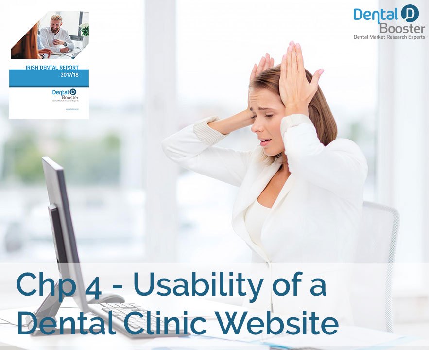
As one of the most important aspects of owning a website, it is essential that you offer a user-friendly experience that will entice potential clients to want to learn more about what you have to offer. Otherwise, up to 48% of your visitors will become frustrated and leave your page.
From understanding the benefits you’ll experience from a user-friendly website to learning how you can take advantage of enhanced usability, we’re going to delve into the details of just how beneficial it can be to have a stunning and easily navigable website. A lot of the enhancements we discuss here only take a few minutes to install, and generate ongoing benefits for your Dental Clinic.
The Key Benefits of Having a User-Friendly Dental Website
As a dentist in the modern age, you should be aware of how important it is to maximise your efforts and build a trustworthy online presence. Not only is it important to consider things such as SEO and having an aesthetically pleasing site, but it also has to be usable for your target audience. Although it can be easy to get swept away in the idea of adding more images, brighter fonts, and dozens of pages for your clients to browse through, it’s not the most effective way to create a user-friendly website.
1. The Best Browsing Experience Possible
The first thing to consider is how simple it would be for your clients to be able to go to your website and get the information they need. It’s said that approximately 61% of internet users are more likely to click off of websites that don’t offer a convenient and easy-to-use development strategy, whereas potential clients will be 67% more likely to stay on your website if it offers the best browsing experience possible.
In order to make sure that you can offer a phenomenal browsing experience, you’ll need to cut back on the flashy images and outrageous font selection so you can focus more on the information your clients need. Ensure that you offer a navigation bar at the top of the site where they can move from one page to another and implement a search bar where they can browse for specific keywords on your site.
Everything should be laid out professionally and right in front of their eyes so they can find the information they need without spending hours looking for an answer to a single question. Just remember, the easier it is to browse, the more time people will spend on your site.
2. Accessible to All Potential Clients
Another large benefit of having a highly usable website is that it will be simple to navigate through for absolutely anyone ranging from the elderly to the blind. If you don’t take these demographics into account, you could be missing out on a large chunk of business that will be stolen by competing dentists. Approximately 285 million people in the world are said to be visually impaired, 82% are at the age of 50 or older (www.who.int/mediacentre/factsheets/fs282/en/).
Making your website accessible to everyone is easy, especially if you’re working with a web development firm that has experience with accessibility options. There are different ways to help make your website more usable by the elderly and disabled, such as ensuring that screen readers can be used to access different parts of your website.
3. Enhancing Professional Appearance
People who typically use the Internet to look for a dentist generally have an idea of what they’d like to see when they open a web page. In the past, websites offered an array of design schemes ranging from bright hot pink backgrounds to flashing red text against tiled images. In fact, according to a study conducted by the Nielson Norman Group, the most information a reader is likely to pay attention to is 28%. This means you’ll have to make the most out of the 28% of information you should have on your site.
In today’s day and age, it is important to consider the features that will accentuate the personality of your dental practice. Do you want to offer a professional appeal that sets you apart from other dentists in your area? This is when a professionally designed site is what will make the difference between an influx of new patients and a steady flow of current ones.
Your clients want to see a clean, clear, and concise website that is obviously put together by a team of professional developers. They want to read through content that is written with the highest attention to detail and that helps them understand the importance of visiting a dentist. Also, they’ll want to be able to find the information they need as quickly as possible.
The more professional your website is, the more likely people are to visit your practice as they will assume that your services will complement the design of your site.

of people at the age of 50 or older are visually impaired and will find it difficult to read small font
Having a mobile friendly website is Vital.
of visitors will leave the website before the page loads if it takes 7 seconds
You can check your loading speed with Google's free PageSpeed tool

of Dental Clinics in Ireland have an integrated map on their homepage
A Map is a great way of showing potential patients how to get to your clinic
47% of all website users expect an entire website to load within 2 seconds
4. Substantial Increase in Revenue
According to the Society of Digital Agencies, approximately 77% of website owners are at risk of losing clients due to poor user interfaces which results in a substantial loss in potential patient conversion.
As mentioned, having a usable website is essential for grabbing visitors attention and turning them into paying patients. The more clients you’re able to work with, the more money you’re inevitably going to bring in at the end of each month. In fact, the majority of dentists need to rely on marketing efforts to bring clients into their practices, as they essentially have to sell the benefits of their office to potential patients.
With the help of a usable website that is either designed by a professional team of website developers, you’re easily going to bring in approximately 40% more in revenue each year. All of this will be as a result of an effective marketing strategy and a usable website. Take a moment to consider what a 40% increase in revenue would mean for your business, and it’s easily accessible as long as you’re able to develop a user-friendly website.
5. Easier to Manage
Once you have a user-friendly website established, there will be the need to maintain and update it through the years to ensure your content stays fresh and remarkable when compared to other Irish dental practices. On the back end of the website, you won’t have to sort through an ample amount of messy code or spend hours trying to find the right blurb of content that needs to be re-evaluated.
The more effective your website design is, the easier it will be for you and your website development team to manage and you can save up to 50% of your time. You won’t have to spend more money on changing outdated coding, as you’ll essentially be working with modern methods that can easily be removed or enhanced to accentuate the best features of your site.
Over time, you may even get enough experience to where you will be able to manage the entire site on your own and so you’ll want the framework and content architecture to be as simple to work with as possible.
How to Implement a User-Friendly Website Structure
Now that you’re aware of just how beneficial a user-friendly website can be, let’s discuss how you can enhance the usability of your site with the help of a creative development team, or with your in-house team.
First thing’s first, let’s take a moment to think about what a user-friendly website should do:
- Answer questions and provide solutions
- Be responsive and easy to load
- Offer clear and easy to read information
- Give visitors the ability to visit a small selection of pages
- Adapt to the needs of your users
- Offer clear navigation options
- Every piece of information on the page has a purpose!
HOW TO GET TO YOUR CLINIC?
– IMPLEMENTING AN INTERACTIVE MAP WITH DIRECTIONS
Let’s take a moment to consider that approximately 74% of the people visiting your website are interested in finding the location of your business and your hours of operation. 74% is far more than half of the average number of users you’ll receive on a daily basis. This alone proves why you need to add a map with directions on your website.
It is no coincidence that Google My Business shows all of this information in an clear and precise way. Google My business aims to display the best suited LOCAL businesses for Google searches.
For a quick recap on Visibility, check out this video
With services such as Google Maps, website owners have the ability to embed personalised maps on the home page of their website. Your map should be on the front page as it gives potential patients the information they need immediately instead of having to search for it. If you prefer to have the map elsewhere, there should be a hyper-link that will direct visitors to a page where they can review the location of your business and your hours of operation.
What is equally as important is taking a look at your Google Maps listing. If you were to search other dental offices in Ireland, you might notice that not only does their Google Maps listing give directions and hours of operation, but also customer reviews, a direct link to the company’s website, and contact information.
The benefit of this embedded map, is that viewers of your website can click on the location, and instantly get information regarding directions, opening time, and current distance away from where they are. The great thing is it only takes a few minutes to install an interactive map.
HOW EASY IS IT TO CONTACT YOUR CLINIC?
– ADDING THE RIGHT CONTACT INFORMATION ON THE HOME PAGE
Put yourself in the position of a potential patient searching for a dentist on the Internet. Once you find that a particular practice offers the services you need, what’s your next step going to be? You’re going to want to book an appointment or at least ask a few initial questions.
Adding your contact information to the front page of your website is imperative, as 64% of your regular traffic is from people looking for your phone number, email address, or your physical address. It gives potential clients the ability to contact you for free to answer any questions they may have or to book an appointment.
Considering that 64% of your traffic is from people searching for your contact information, without it you will be losing a substantial amount of potential conversions. Conversions are necessary in any business as they are interested individuals who can quickly become long-term patients.
According to the British Dental Journal, approximately 37% of patients contact their dentist through the Internet. The average dentist in Ireland makes approximately €47,457 annually and so imagine losing 37% of €47,457 due to not having contact information on your front page. That’s approximately €17,560 worth of lost revenue.
It is important to make sure that your contact information is clear, concise, and readily available to access while potential patients are on-the-go. As an example, adding a text-to-call hyper-link where they can easily click on your phone number and it automatically dials it from their smart phone.
of your regular traffic is from people looking for your phone number, email address, or your physical address
Is this information readily available and visible on your website?
Can you handle €17,560 worth of lost revenue? Then ensure that your clinic has the basic contact information that potential patients need to contact you.
VISUAL APPEARANCE?
– USING COLOUR TO YOUR ADVANTAGE
Colours, much like music, invoke certain emotions and can make or break the relationship a potential patient has with your website. By choosing the right colour palette for your site you can build trust with your patients, entice them to learn more about your services, and even make them feel more at peace while browsing.
You can get an idea of what colours would work best with your website with tools like Red Alt – I Like Your Colors, ColRD, DeGraeve Color Paletter Generator, and Adobe Kuler.
I have spent a lot of time talking dentists out of certain colour schemes, why? Because they invoke negative thoughts and feelings in the website visitor! One such example was a deep red colour, which replicated blood, any visitors who were squeamish or nervous would leave that website quickly. In your dental branding, use colours which will make the user feel calm, at easy and instil confidence in your professionalism.
The following colours are known to instil very interesting emotions:
With resources such as Colour Psychology in Online Marketing by Al Martinovic, learning about how colour influences a mental state of mind is quite important when designing a website.
In Ireland, there are over 51,718 people who are visually impaired or blind which has made creating an accessible website quite important in the Northern Republic and the UK. To employ an accessible website strategy, consider these tips.

- Red: Energy, excitement, power, and passion
- Blue: Freedom, patience, peace, trustworthiness
- Yellow: Optimism, happiness, brightness
- Green: Naturalness, prosperity, wealth, and health
- Orange: Approach-ability, courage, warmth
- Purple: Sophistication and wisdom
- White: Freshness, youth, purity
- Black: Secrecy, power, mystery
- Grey: Maturity, reliability, security
- Pink: Romance
- Brown: Credibility, strength, stability
IS YOUR DENTAL CLINIC ACCESSIBLE TO ALL?
– THE IMPORTANCE OF USING ACCESSIBILITY FEATURES
Spoken Text for Images: Spoken text is a phenomenal way to easily describe the purpose and function of the visual aids on your website. All you will have to do is use the “alt attribute” for descriptions so they can easily be heard.
Descriptive Transcripts: Over 2% of Ireland’s population is deaf and with the help of written descriptive transcripts for audio and video features, you’ll be adding to the accessibility of your site.
Creating Accessible Links: It’s quite often that when creating links, website owners will edit a hyper-link to read, “CLICK HERE to learn more about us.” Unfortunately, screen readers will only read “CLICK HERE” which is why it’s better to create a hyper-link based on the most important part, such as “Click here TO LEARN MORE ABOUT US.”
If you’re concerned about the accessibility of your website, there are several tools that you can use to check just how accessible it is such as ACTF aDesigner and The Function Accessibility Evaluator (FAE).
Navigation is the single most important part of creating a user-friendly browsing experience, as it allows visitors to find the information they need as quickly as possible. Everything from your search engine rankings to traffic will be negatively impacted if you have a poor navigational system on your website.
LOGICAL, CATEGORISED MENU?
– DEVELOP A CLEAR NAVIGATIONAL SYSTEM
Standard Navigation Placement:
When your visitors enter your website they’re going to expect to see their navigation options either at the top or down the left side of the website. By placing your navigation bar in standard spots, it makes the site far simpler to use.
Minimal Navigation Options:
It’s easy to get carried away when you first start developing your website and this leads to adding too many navigation options on your site. The fewer menu options you have available leads to your visitors paying attention to the more important details and the more prominent items. On average, a website should have approximately 5 navigation options or links (https://blog.kissmetrics.com/common-website-navigation-mistakes/).
Using Links and not Buttons:
The most effective way to ensure web pages load perfectly across all devices and are properly indexed on search engines is to use links to your advantage instead of buttons. Not only are they harder to update over time (you’ll need a new graphic for the button which requires Photoshop experience), but also they’re simply unnecessary.
When you start to develop information for your website, it’s important to create blurbs of content that are easy to read and straight to the point. The average Internet user is as a “scanner”, which means they will quickly browse through a page instead of reading every single word.
Categorisation
One piece of advice we use here, is the phrase “Don’t make me think”, taken from a best selling usability book. The general approach is that a user should not have to think “maybe this is where the cosmetic dentistry information is” or “I wonder what is the difference between Periodontal treatment and gum disease”. The menu structure should be easy to understand and follow. It should have a logical hierarchy, so that the viewers know where they are in relation to the other website content at all times.
EASY TO SCAN CONTENT?
– CREATING EASY-TO-SCAN CONTENT
After spending hours writing the content for your website, you will not want to find out that most viewers will not read the majority of your content. Visitors only pay attention to 28% of website content, as most people scan through a website.
The main purpose for this scanning behaviour through information on a site is to find the content that is pertinent to their needs. As an example, if someone is looking for a dentist that specialises in crowns, they’re not going to want to read through an entire page of information about teeth whitening.
In order to make using your website easier for the majority of your visitors, you’ll want to establish a template for easy to read and scan-approved content. This means you’ll need to create a format with headings, subheadings, paragraphs of 2-3 sentences, and bullet lists to make the information on your site easier to read.
A lot of visitors will view 4-5 dental websites, and choose one or two to contact. The process of elimination starts with each website at a 100% possibility, then depending on what the viewer sees, he/she will eliminate the dental clinics that do not impress. Think of this, they will look at
- The overall appearance of the website, does it look new, professional, or old and outdated
- Is the menu easy to use, can I find what I am looking for
- Does it have signals of trust, such as testimonials, awards, video reviews
- How do the prices compare
- How do the range of services compare
- Does the website look outdated, maybe the dental clinic is outdated too?
- and so on
This is why its important to have website content arranged in a proper fashion, but also content that is easy to read. Bullet points, videos and images are all great to educate the viewer.
Visitors only pay attention to 28% of website content, as most people scan through a website.
SLOW LOADING WEBSITE?
– BOOSTING WEBSITE SPEEDS IS MORE IMPORTANT THAN YOU THINK
The average PageSpeed score of Dental websites in Ireland is only 64/100.
You can check your pagespeed of your webiste with Googles free tool – https://developers.google.com/speed/pagespeed/insights/
Let’s consider some of the most interesting statistics about the speed of your website. According to Aberdeen Group, a 1 second delay in your page loading time can lead to an 11% decrease in page views, a 16% decrease in satisfaction from website visitors, and a 7% loss in conversion. Those are some pretty significant values that could negatively influence the success of your website.
Approximately 47% of all website users expect an entire website to load within 2 seconds and 40% of these visitors will leave the site once it takes more than 3 seconds. Ensuring that you have an incredibly fast website speed is essential to keep people interested in learning more about your services.
In order to create a website that boasts quick loading speeds, make sure that you don’t overload your website with too many pictures and videos. You’ll also want to consider signing up for a hosting package that allows you to deal with high levels of traffic during peak times. Image compression is very important to ensure the images look good, but are small in file size.
The other very important factor of pagespeed or loading speed is your ranking in Google. The loading speed of a website is a major ranking factor, as Google wants to show quick loading websites to its users.
of all website users expect an entire website to load within 2 seconds
Average loading time of a Dental website in Ireland is 7.4 seconds, 24% of visitors will leave the website before the page loads if it takes this long!
Conclusion
The main point to this chapter, is to make you aware that there is a lot of small important details that can be overlooked when building a website. A professional Dental website developer will take the steps necessary to ensure that the website is created properly.
A lot of the points here are common sense, have a website that is easy to use, that delivers the information that the visitor wants as quickly as possible. One that takes visitors with disabilities into consideration, and is up to date and compatible with modern devices. If you need help optimising your current website, please get in touch with us today!
Personalised 2017/18 Report now available
